The average rate of shopping cart abandonment, based on dozens of research studies, is 70%. That’s just a fearsome statistic. To make it more concrete, imagine you’re making $10,000 in online sales each month. According to that average abandonment rate, your $10,000 represents only 30% of the potential sales you could have had. Reducing the number of abandoned carts – even by 10% or 20% – would result in a notable uptick in sales.
In other words, there is a ready source of sales growth hiding in plain sight for most direct-to-consumer sites. But any effort to drive down abandonment rates starts with understanding more about why customers walk away from their shopping carts in the first place.
Why do book buyers abandon their carts?
The following bar chart shows the top reasons that American consumers abandon their shopping carts.
The graphic is based on 2015 data, but not much has changed and the general findings are consistent across a wide range of research sources and applicable in Canada, too. As Shopify notes, “Every time, these reports list the same old issues …. such as:
- Being forced to create an account
- Struggling with complicated checkout processes
- Unexpected delivery costs
- Concerns over security
When we designed the ReaderBound checkout process, we considered each of those four issues and how to combat them.
Problem #1: Being forced to create an account.
Some people just hate creating an account in order to buy things. They want to speed through the checkout and just get what they want. An experiment by User Interface Engineering found that customers were 45% more likely to buy something when the checkout page did not have forced registration.
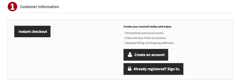
That’s why our publisher sites contain an “instant checkout” option. There, visitors have only to enter their email and name, and their shipping information.
Problem #2: Struggling with a complicated checkout process.
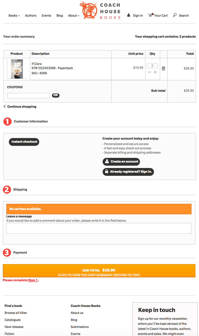
Ugh! There’s nothing more annoying than having to fill out page after page of details in order to get a couple of books. Your customers are coming to your site to buy from you because they like you and want to support indie presses. That’s a precious thing and it deserves a single-page checkout … which is what all ReaderBound sites have. The image below shows a checkout page on the Coach House Books website.
Problem #3: Unexpected delivery costs.
Shipping presents one of the toughest challenges for indie presses because … Amazon. While you might not be able to match the “freeness” of much Amazon shipping, you can make it clear to your customers that you are doing everything you can to lessen shipping costs for them. You can offer no flat-rate fees, different shipping options at different price points, and more. It can also be a good idea to assume some of the shipping charge for the customer because the direct sale means you aren’t paying the bookstore for handling your books. If you do this, make it obvious that that’s what you’re doing; all consumers like to see a slashed price. Another possibility is offering free shipping for the purchase of more than one book.
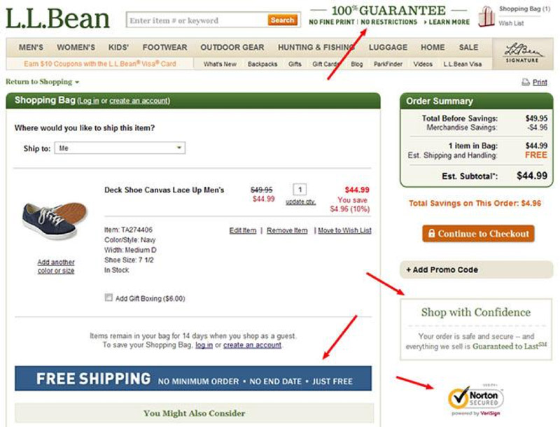
If you can offer a discount on shipping, by all means, trumpet it. L.L. Bean highlights “FREE” shipping in blue, but you could just as easily use that space to show a price break (e.g., by crossing out the real price and inserting the discounted price).
It makes sense to play around with ways to lessen the sticker shock of shipping costs to see what works best, and ReaderBound makes it easy for publishers to experiment in this way.
Problem #4: Concerns over security
On ReaderBound, all transactions occur through major, advanced systems such as PayPal and Moneris. These systems are trusted by consumers, reliable, and safe, and ReaderBound checkouts advertise that security front-and-centre.


